
As a marketing agency that specialises in financial services, it’s safe to say that we’ve seen our fair share of websites within the field. Some are instantly striking, some are informational but a little stiff and some are sadly forgettable. The financial industry is filled with technical jargon and can often feel alien to someone on the outside looking in, trying to find help. That’s why having a website that cuts through the noise and brings clarity to everyday personal finance is so crucial.
To highlight the best sites of the moment, here’s our take on 2021’s top 10 financial websites:
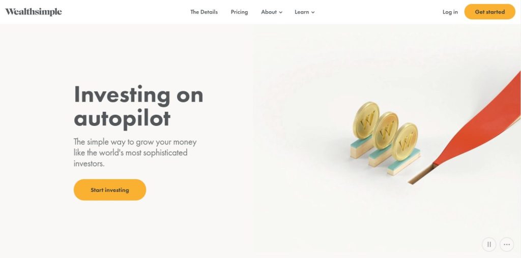
1. Wealth Simple – for its simplicity, funnily enough
Wealth Simple market themselves as “Investing on AutoPilot”. Their goal is to give everyone a simple way to grow your money, just like the world’s most sophisticated investors. There isn’t a huge amount more to say about what they do, because as their name suggests, they keep things simple.
Following suit perfectly, their website also screams simplicity. It’s well developed, direct and professional while maintaining a youthful feel. There are just four tabs with their ‘Details’ page featuring lots of animations and well-known catchphrases to make investing relatable. Their three-tier pricing structure also lets you quickly evaluate which investment plan you can afford. Simple.
2. Abacus Wealth – for its family feel
Abacus Wealth is set on helping their customers answer the big financial questions and their site is packed with images of families clearly enjoying their financial freedom through finding these answers. What we love about their website is its clear calls to action and easy navigation. They also feature an ‘insights’ section that is broken down into issues that might affect women, the LGBTQ+ community and also money meditations. Their modern style makes their site approachable and easy to use.
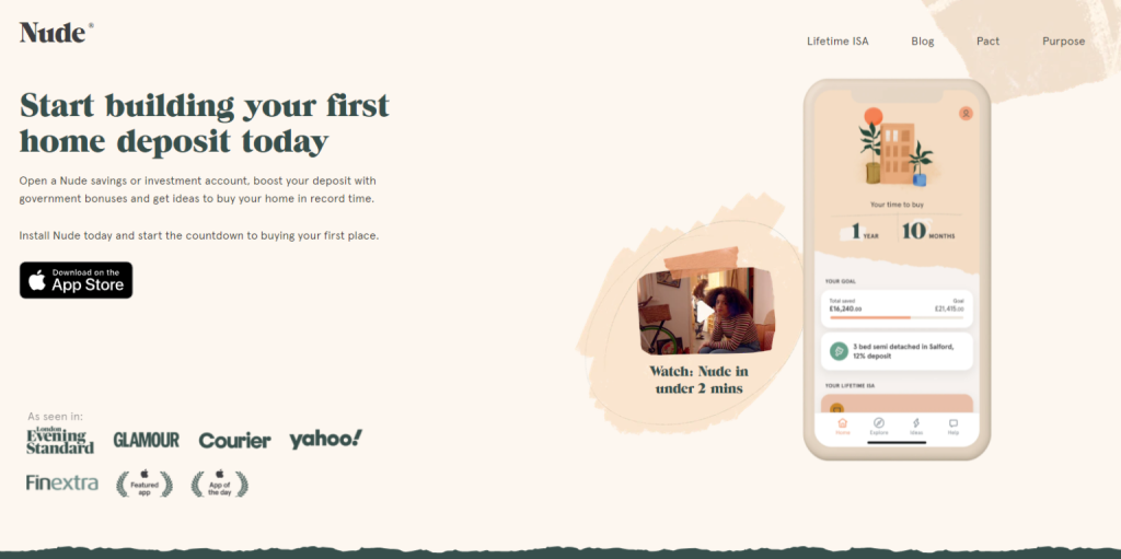
3. Nude – for oozing style
Nude has created a cool and stylish way to save for your first home. Downloading the Nude app and opening a savings or investment account helps you boost your deposit to get on the property ladder. They carefully incorporate the government bonuses and give ideas on how to buy your first home in record time.
The Nude website is colourful, engaging and youthful. Its target audience is clearly first-time buyers and they’ve hit the mark with millennials with their fun and funky design. The homepage sets out in four clear steps how Nude can help you buy a home, and as their tagline states, “in record time”.
We love the pastel colours, abstract designs and glimpse of their countdown timer – who knew buying a property could be so fun?
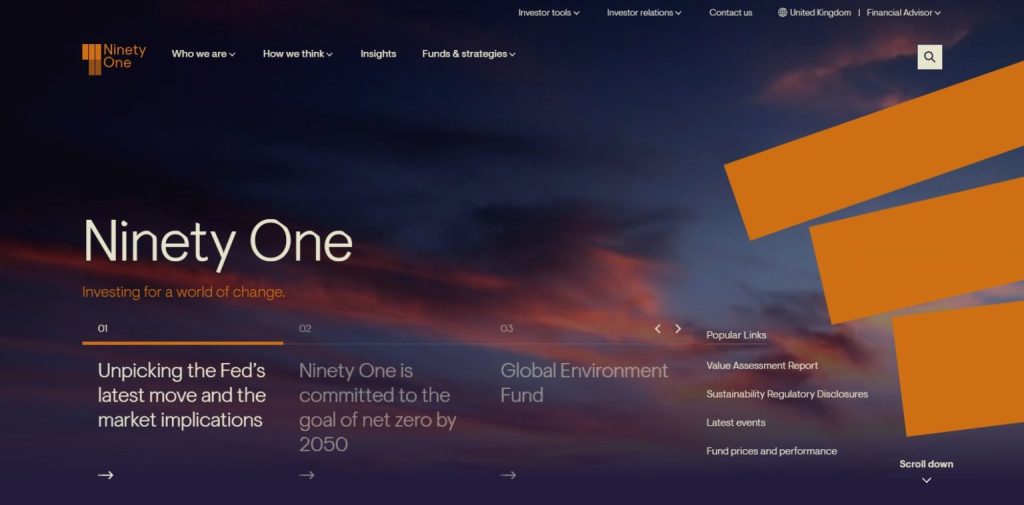
4. Ninety One – for its innovative design
The Ninety One website greets you with a calming mountainscape and hits you with alternative headings such as, “How We Think” rather than “What We Do”. They’re active investors that focus on making a real difference for their clients, helping them achieve their long-term investment goals. But instead of having a clinical, corporate tone, the website is striking and progressive and proudly displays its initiative to have net zero emissions by 2050.
The paragraphs are short and succinct, making it an attractive read and their brand colours are bright and cheerful. A website whose innovative design makes you believe they really are an innovative company.
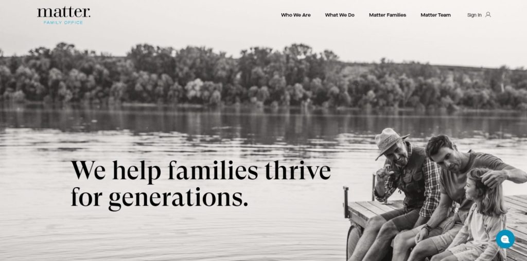
5. Matter Family Office – for its clean layout
Matter Family Office was founded to help successful families seize the opportunities of wealth and avoid the pitfalls. Through this goal they lead their clients on a purpose-driven path that supports their goals and values through a number of different services.
The black and white imagery immediately ignites a sense of familial nostalgia and makes the homepage beautifully crisp and clean. As you scroll down, the icons boast of their impressive client retention rate and multi-generational client base. They go on to break down five key services they offer to aid you with your investments. There’s no lengthy jargon or stream of corporate images or team members. It’s simple and it’s effective. It shows it’s about the client.
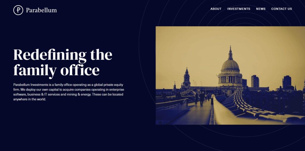
6. Parabellum Investments – for its bold and simple design
Parabellum Investments is a family office operating as a global private equity firm. They deploy their own capital to acquire companies operating in enterprise software, business and IT services and mining and energy anywhere in the world. Their striking blue and white brand colours are softened by the sepia tone photographs featured on their homepage. Their mission is clear – to be a “new class of investor” and a “family office with a difference”. This message is portrayed clearly through their website.
Besides the usual news and contact pages, they have just one tab titled ‘Investments’ that gets straight to the point about what they do and how you can use them. Their font and messaging are both simple and bold, giving prospective clients confidence that they have experience and are the people to get the job done.
7. Wealth Matters – for their all-round good financial planning and upfront fee disclosure
The Wealth Matters homepage exudes the feeling that they’re a firm that will put your family first. From the hero image of a family walk on the beach, to the featured testimonial video and their tagline, “financial planning for total peace of mind”. Their brand message is clear: “armed with a financial plan, you can live your life to the full”.
Unlike most financial planning websites, Wealth Matters has an upfront and clear fees section on their website so that potential clients don’t have to worry about enquiring about a service they can’t afford. Their promise for clear and transparent fees is met with their cost breakdown, which even includes a price promise, reassuring you that they will keep your best interests in mind.
We may be biased on this one as they are a client of ours, but this is an all-round good financial planning site that boasts transparency.

8. Waterfield – for their award-winning philanthropy
Waterfield Advisors offer unbiased and bespoke wealth advisory services with a “no conflict of interest” model. They’ve pioneered the concept of unbiased wealth advisory in India. Visiting their website shows you they’re a results focused business, as they proudly display the last four years of awards they‘ve received on their homepage.
Their promise to “bridge the gap between your reality and your purpose” rings true through not only their website – including a well positioned photo of a beautiful bridge on the homepage – but through their business as a whole. The years have seen them grow from being nominated as ‘Best Firm for Estate Planning and Philanthropy’ in 2018 by The Wealth Briefing Asia Awards Body through to their 2021 victory as the ‘Best Private Bank for Philanthropy in India’ by The Asset Triple A Category Awards 2021.
It’s great to see a firm telling the whole story of their success to potential clients.

9. Caprock – for their clean and immaculate presentation
According to Caprock, “it’s time to rethink your wealth”. On this homepage, there’s no lengthy explanation of who they are and what they do, but three simple headings that give answers, fast. The simplicity of their homepage is carried on throughout the rest of the site as they introduce you to wealth-sustaining solutions and a broad team of experts. The navy, copper and white theme is uniform across all the pages. Although some may judge them for their lack of images, we think it keeps the site clean and efficient. Which is exactly what you want from a company looking after your wealth!

10. Generation Home – for being functional, clear and meeting the reader’s needs
Generation Home is the mortgage lender built for first-time buyers, by first-time buyers. They’ve taken stock of the current financial climate and realised that homeownership has moved out of reach for millions of people, denying them the financial security that generations before them have taken for granted. Since launching in 2020, they’ve been striving to give everyone the opportunity to become a homeowner.
The website is modern, fresh and functional. It does exactly what it says on the tin, which is exactly what’s needed to help millennials break through the jargon to buy their first home. Its black, white and red theme is bold and easy to read. There’s also a page featuring their interest rates which, like everything on the site, is transparent and easy to understand.

Do you agree with our choices?
Marketing doesn’t sit sill, so we look forward to revisiting this list and discovering great new websites in the financial industry. We’d love to hear your suggestions, so let us know if you think there are any brilliant financial websites we’ve missed that the world deserves to know about.